Veles visualizations are purely statistical representations of binary data. We take a sequence of bytes and visualize correlations between certain values. It doesn’t matter if it’s an executable file, a picture or a disk image – from the perspective of visualization any file is just a sequence of bytes.
There are a few different visualization modes supported by Veles: digram, layered digram and trigram. Let’s explain them one by one.
Digram
In digram visualization we look at all 2‑byte sequences (digrams) and compare their relative frequency in the file. We treat each 2‑byte sequence as pair of coordinates that we draw on a 2d surface. Let’s imagine a tiny example file made of following bytes:
|
1 |
02 03 05 01 |
To create a digram visualization we iterate through the file and list all the 2‑byte sequences we encounter: <2, 3>, <3, 5>, <5, 1>. We treat each pair as a 2d coordinate of a point we put in our visualization. The result is shown on the diagram below:
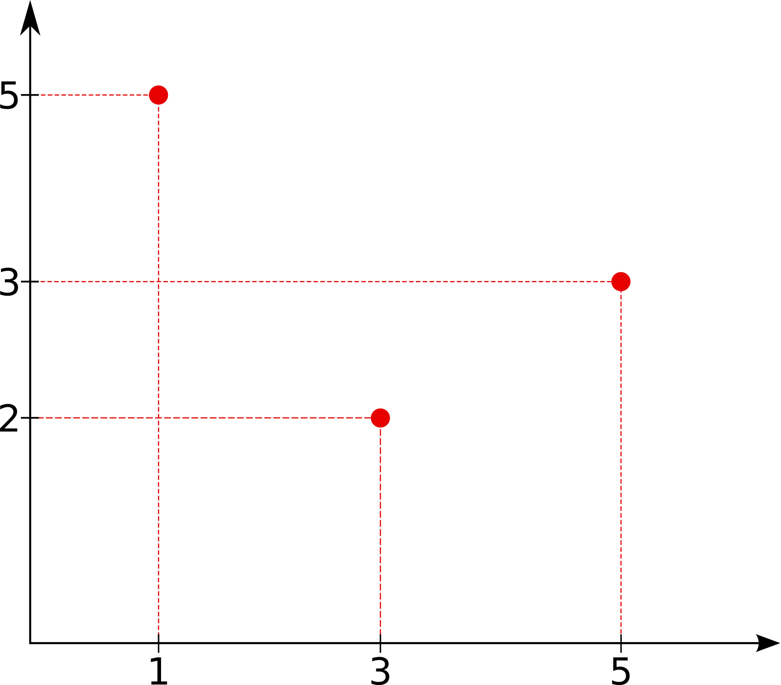
Note that each byte (except the first and the last one in the file) is used twice, once as a coordinate on x‑axis and once on y‑axis.
Of course real files are much larger and contain many digrams. In Veles the brightness of each point is determined by the relative frequency of each digram in the file. The most common ones will be white, while those encountered only a few times will be very dim, almost completely black. Let’s take a look at a few examples:
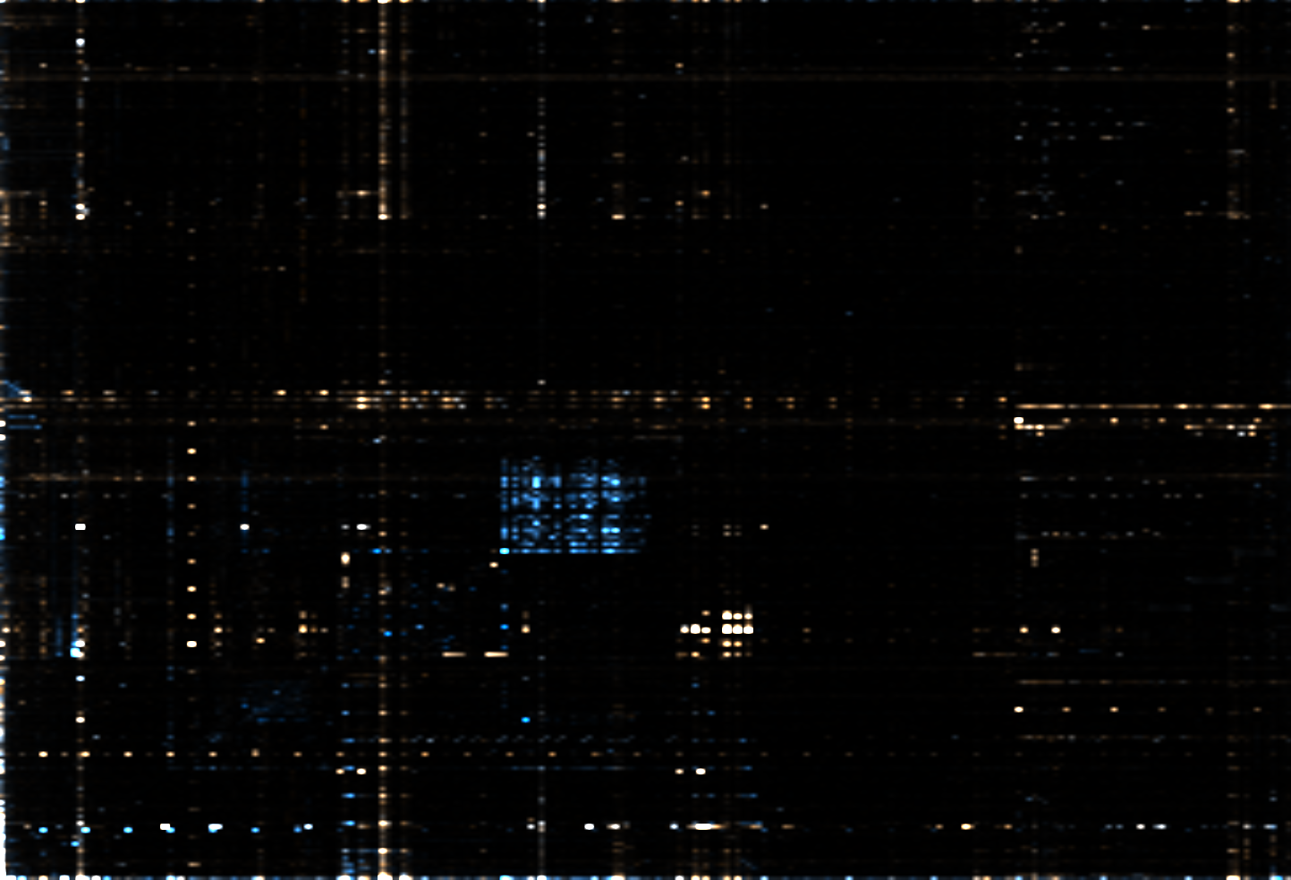
Colors
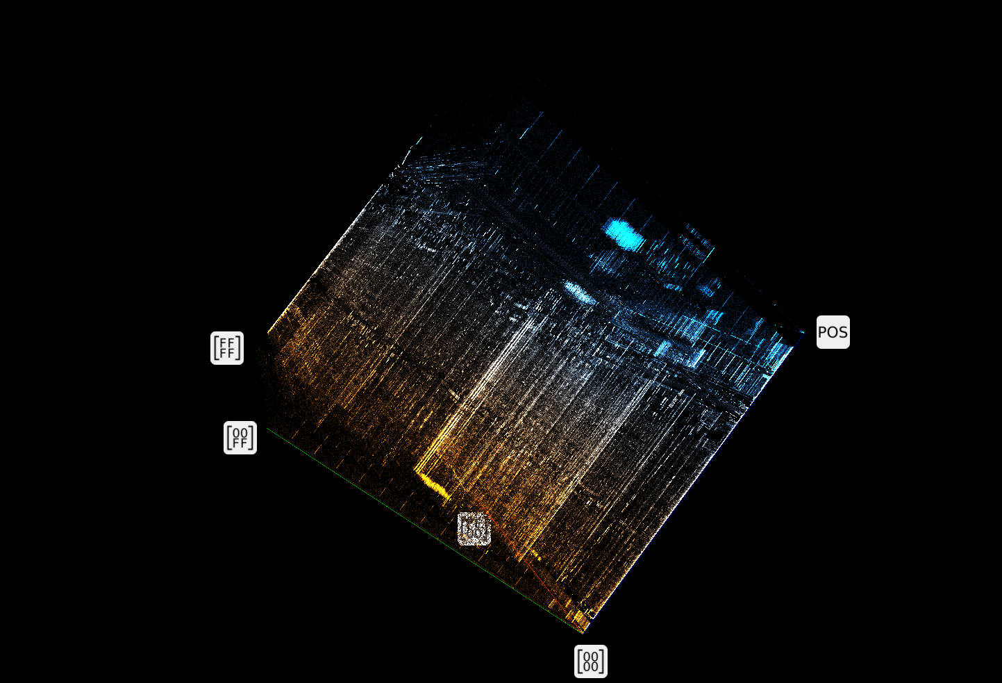
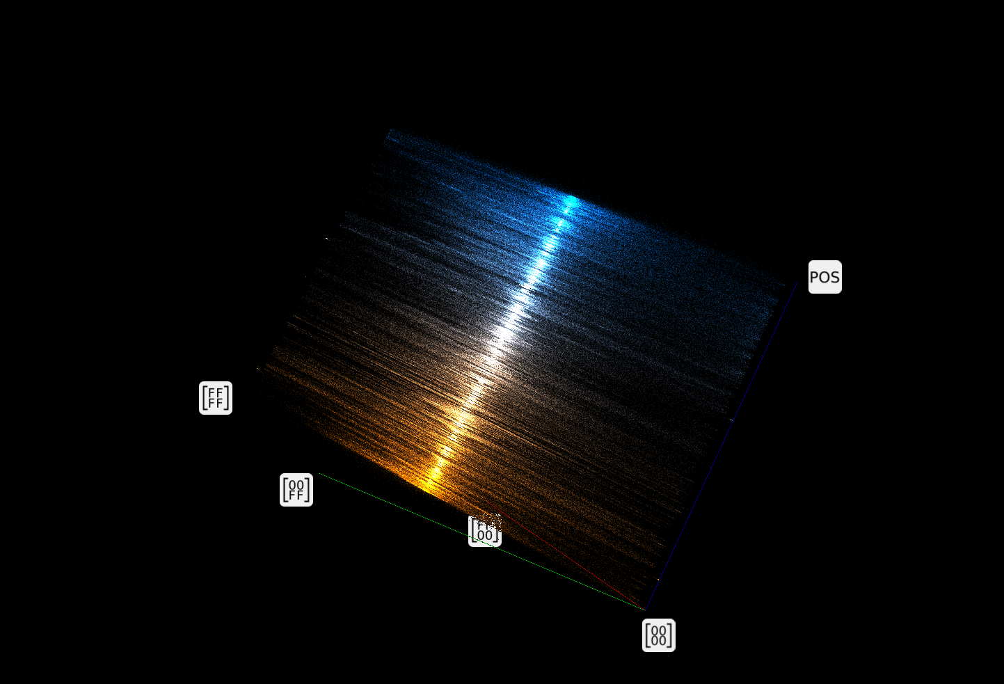
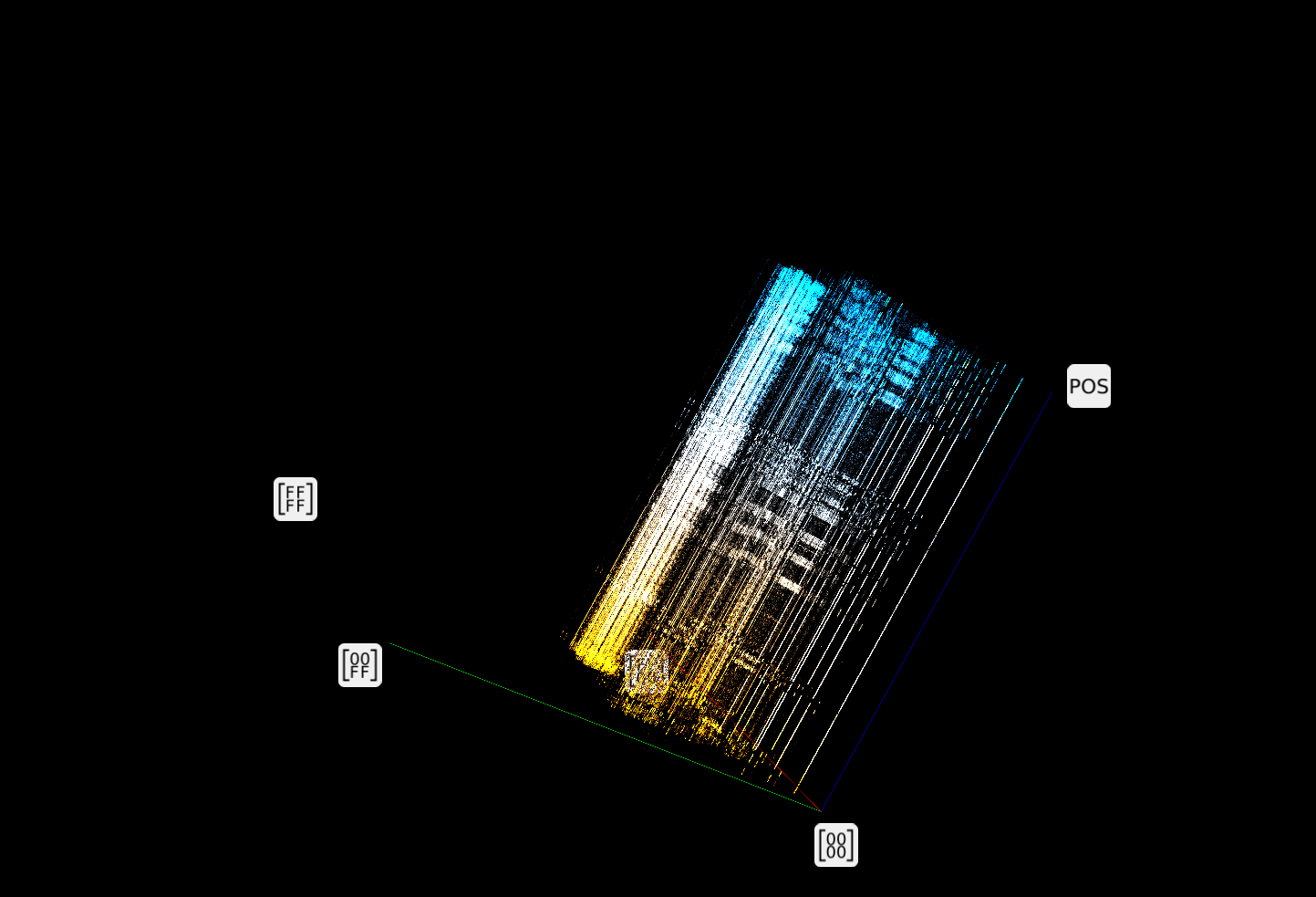
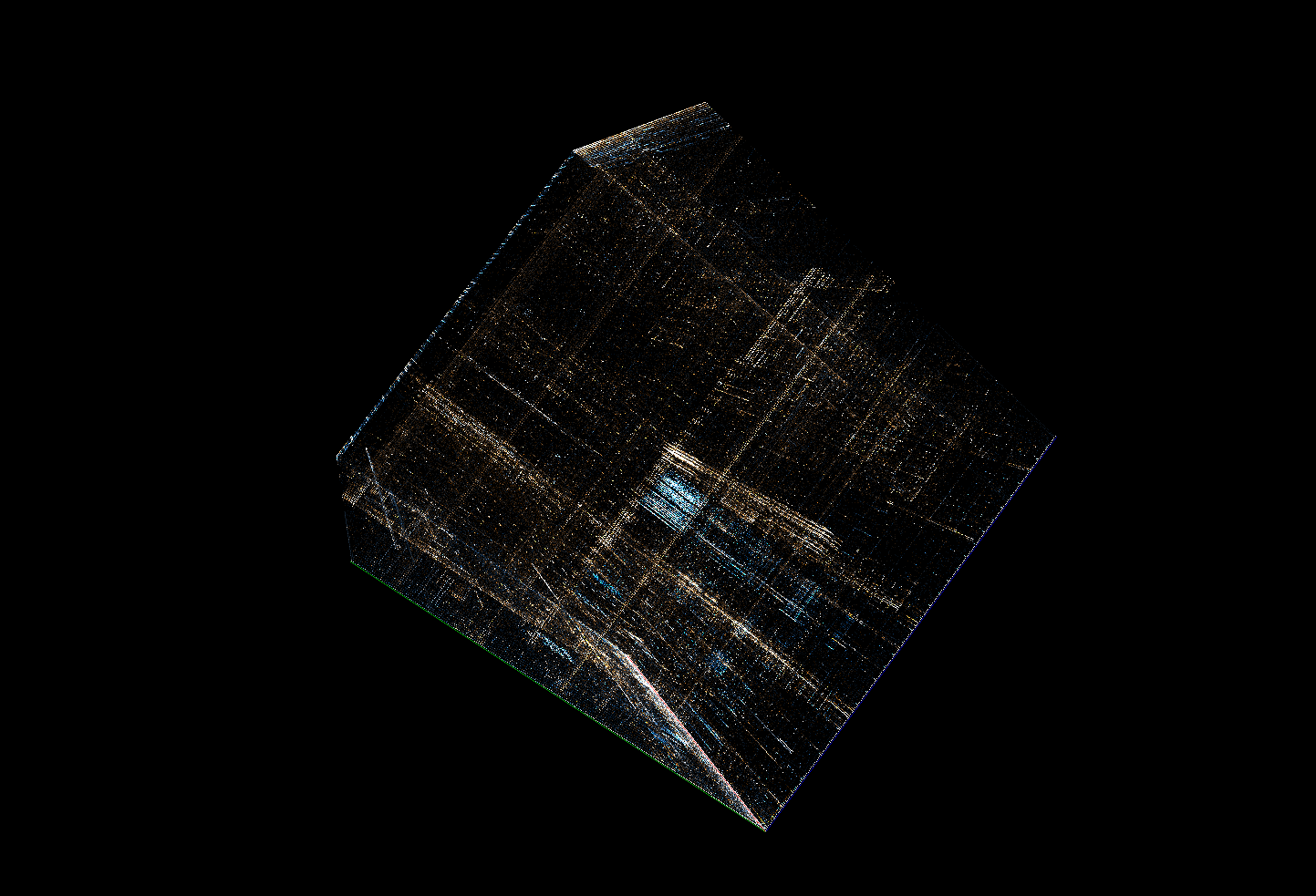
Based on the description above everything should be grayscale, however, there are different colors visible on the screenshots above. Veles uses them to add just a little bit of information to the visualization. If a digram is found predominantly at the beginning of the file the corresponding point will be more yellow. If it’s more common at the end it will be blue. If it’s evenly distributed or most common in the middle of the file the point will be white.
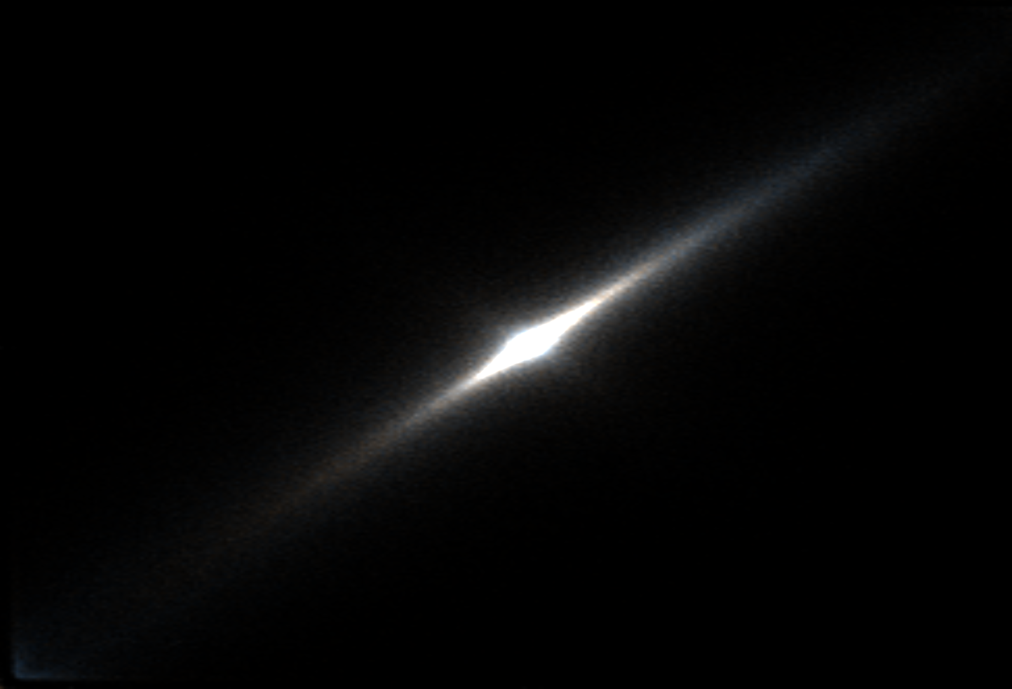
Layered digram
In this visualization we divide the file into 256 evenly sized parts. For each of this parts we calculate a digram visualization. We display all of those visualizations on top of each other to create a 3d cube showing how digram distribution changes through the file.
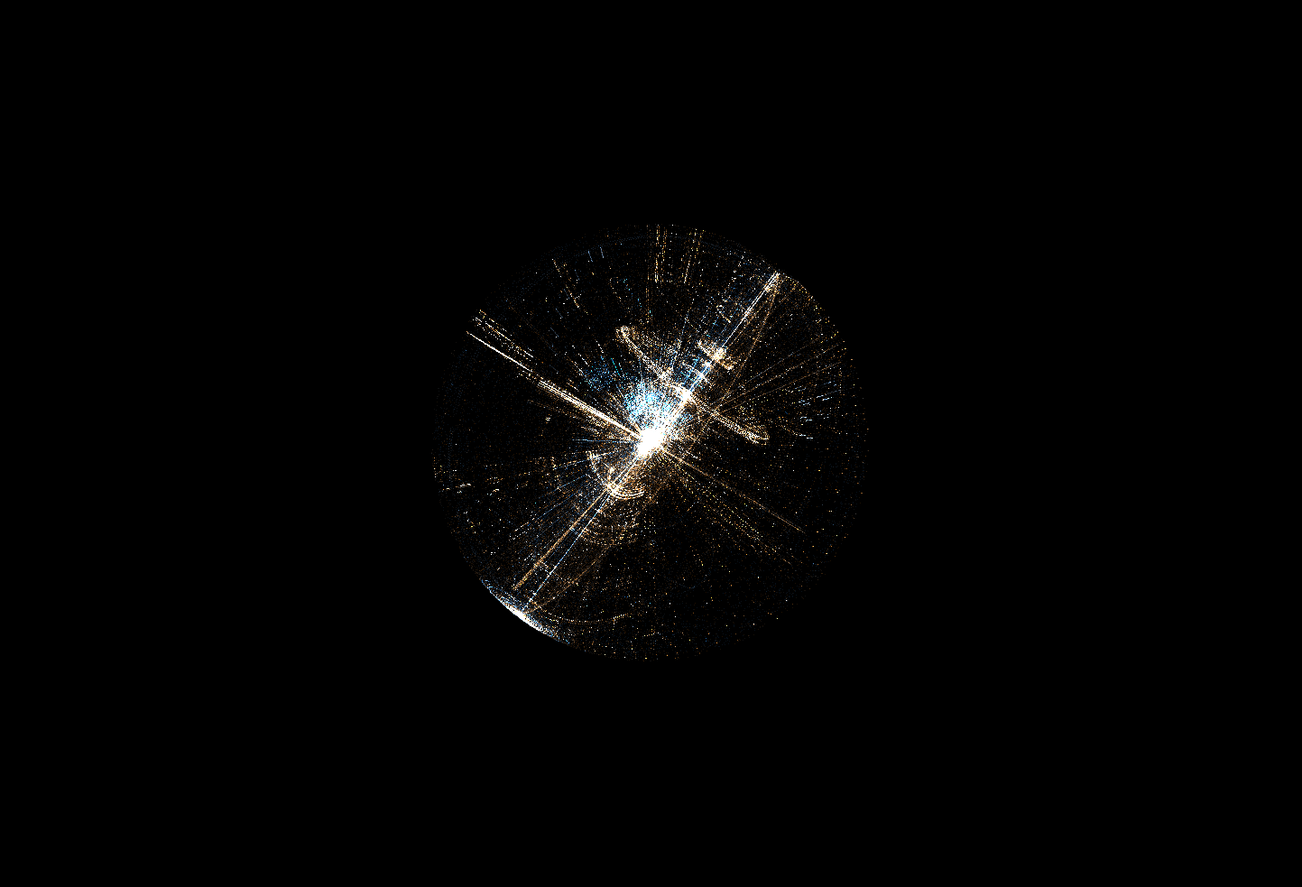
Trigram
This view is most easily explained by relating it to the digram view. In fact it’s exactly the same thing, except this time we use 3‑byte sequences (trigrams) to create a 3d cube. Each byte in the file is used 3 times: once as a coordinate on x-axis, once on y-axis and once on z-axis. The meaning of different colors is also the same as in digrams – yellow for trigrams most common in the beginning of the file, blue for those found mostly at the end.
Shapes
Trigram and layered digram views give user the option to change the shape between cube, cylinder and sphere. All those views present exactly the same data. Each point is represented by 3 values (trigram or digram + layer number). By switching between cartesian, cylindrical and spherical coordinate systems we get different graphical representation of the data.

Sampling
Performance‑wise it’s not always feasible to visualize the whole file. For larger files the amount of data to process is just too much. However, the binary visualization is most useful when working with large files.
In Veles we handle this problem by visualizing a sample of data instead of the whole file. Sampling is done before any further processing. From the point of view of visualization the sampled data is the byte stream we’re analysing. Increasing sample size improves accuracy of visualization and limits the chance of introducing artifacts at the cost of performance. Depending on available hardware we normally use sample size between 1MB and 10MB.
Note that Veles will not sample files smaller than the sample size set by user. In that case it just shows the whole file. Additionally we provide an option to disable sampling in UI. Selecting this option will lead to poor frame rates or even crash Veles when working on very large files!
Uniform random sampling
Let N = sample size. The default sampling algorithm randomly picks sqrt(N) continuous byte sequences of size sqrt(N) from file. This approach is a compromise between the need for taking data from multiple different places in the file and the requirement for the sample to represent actual byte sequences for n‑gram visualizations.
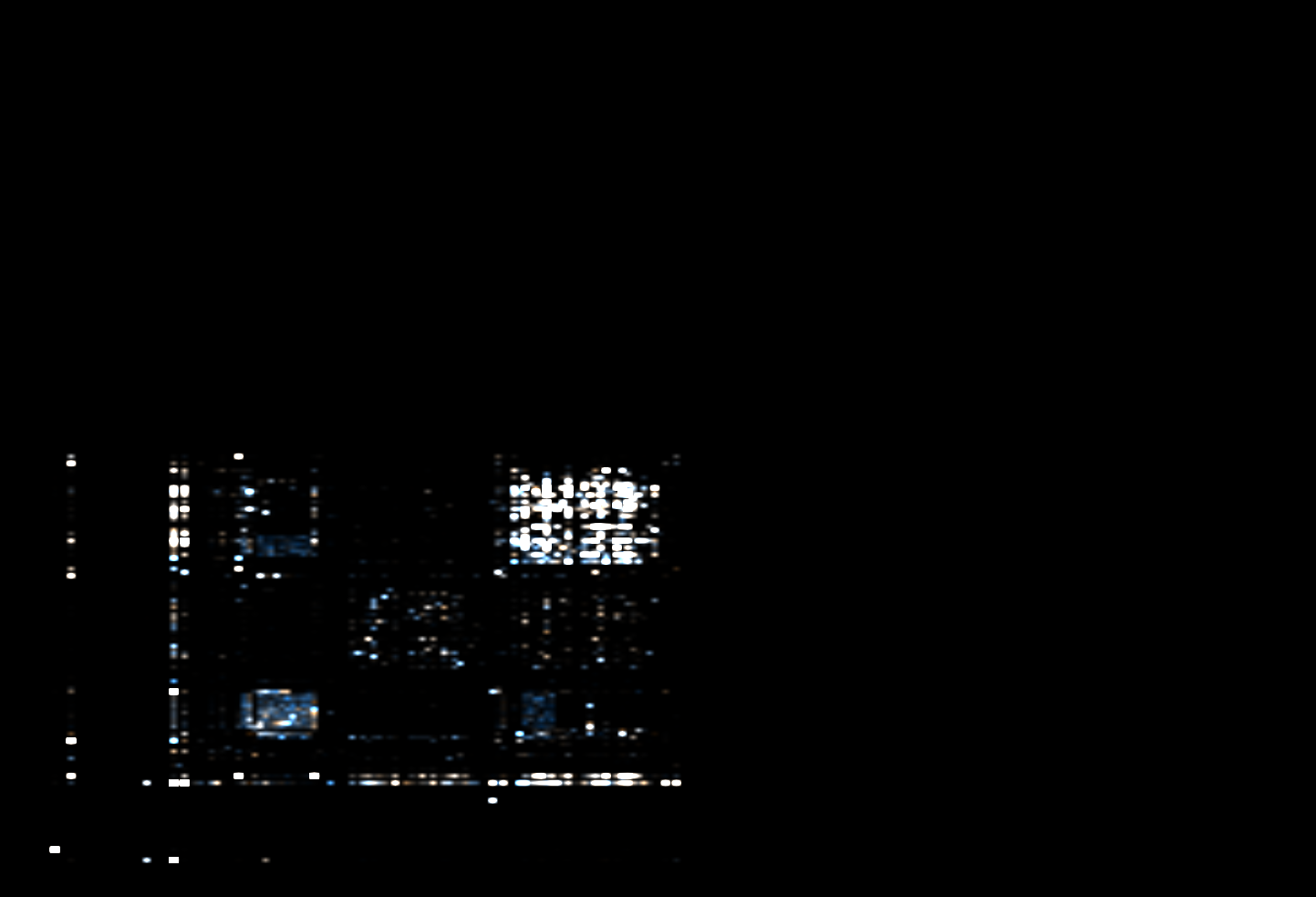
Minimap
The panel on the left side of the visualization is minimap. It shows a simple visualization of the whole file. You can slide the 2 bars to select a (continuous) part of the file. Only the selected part of the file is visualized in the main part of the window.
You can add additional minimaps if you want to zoom in a specific part of the file. Leftmost minimap always shows the whole file. Each consecutive minimap shows only the selected range of the previous one. Using 3 or 4 minimaps you can easily select just a specific few hundred of bytes out of a very large file.
Minimap modes
Minimap divides the file into parts of equal size and represents each part with a single texel. The file is represented left‑to‑right and top‑to‑bottom. In default (green) mode the value of each texel is calculated based on average value of bytes in the corresponding part of the file. Alternative mode (red) shows the Shannon entropy instead.
Check out our earlier post to see how we can identify different parts of a real file (libc.so from Ubuntu 14.04) and find out CPU architecture of the machine: Binary data visualization.
Veles visualizations were inspired by Christopher Domas’ talk from Derbycon 2012. Check out the video of his presentation https://www.youtube.com/watch?v=4bM3Gut1hIk.